Making it easier to upgrade your insurance coverage
Business owners struggled to find the coverage upgrades they needed to fully insure their business. I led the design of an updated experience from start to finish, balancing business requirements, technical limitations, and UX best practices.
Role
Lead UX Designer
Collaborators
UX designer, Business analyst, Developer
Duration
~ 8 months
Year
2024

However, when users got their quote, they had trouble customizing it because they simply couldn’t find the options.
The product adjustments were hidden in a modal, in a link, in a dropdown. That makes three clicks to change your deductible, if you can even find it.
Hiscox Insurance offers a convenient online portal for customers and agents to purchase coverage.
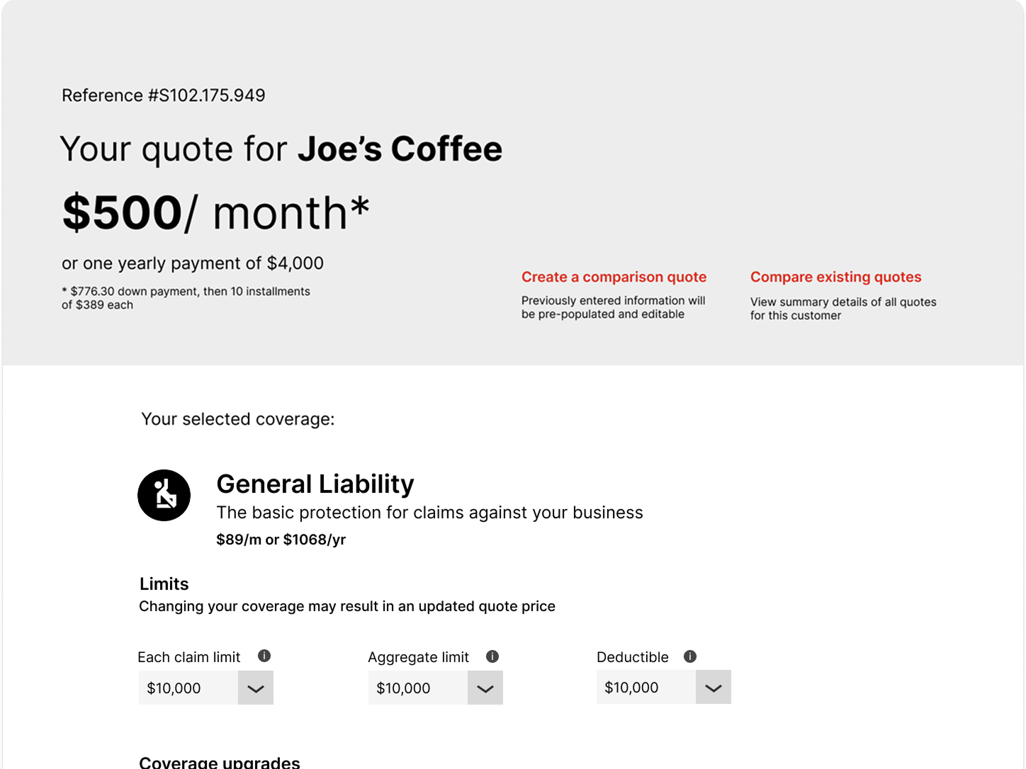
Original user flow
So, why does this matter?
1
The quote page is the last (and for some user types, only) chance to get the right coverage.
Many business owners need to meet specific requirements for their client contracts.
2
3
We can easily lose a sale if users don’t think we offer the coverage they need.
The coverage options needed to be discoverable and easy to add, so I included them right on the page.
Insurance is notoriously complex and wordy, so I had to prioritize what information should be exposed
I made sure to consider the risks of adding more information to this page, but felt it was worthwhile to ensure users knew we could offer comprehensive coverage
We wanted more users to be able to access customizations on the quote page, so they can buy their perfect policy from Hiscox.
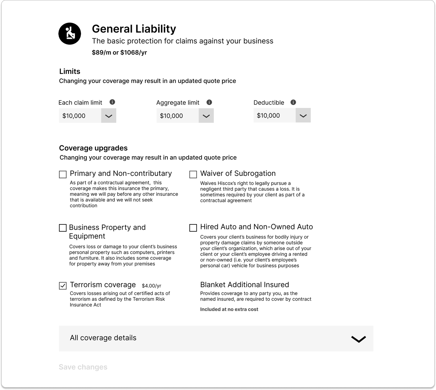
New format for limits and upgrades
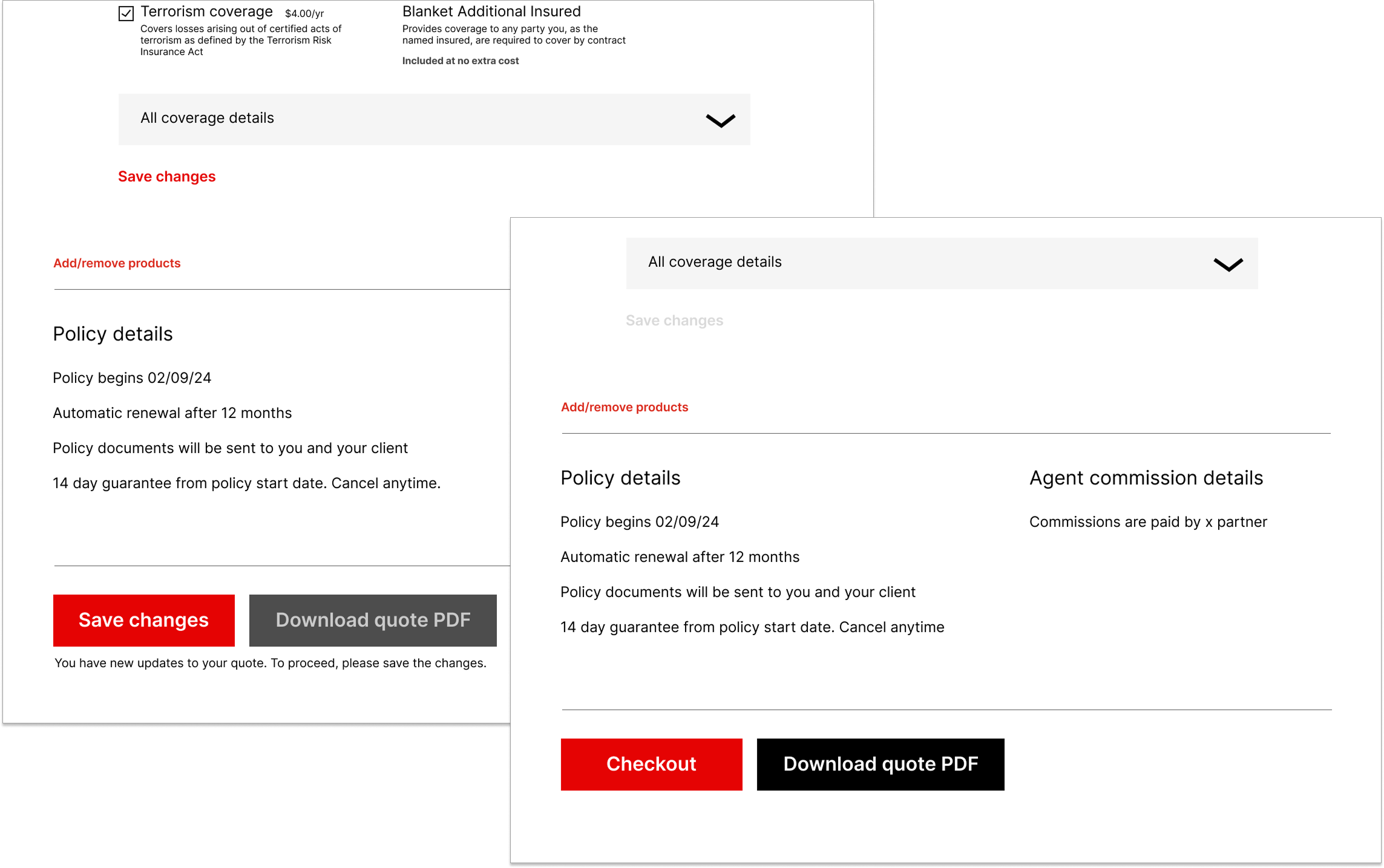
Unfortunately, our system did not allow for asynchronous refresh, and struggled with long load times.
We wanted to mitigate what the user saw of these limitations, so we added save buttons for batched changes.
We placed multiple save “checkpoints” along the page, so there’d be no surprises. We wanted to make sure users saw the new price before continuing to bind.
For the best experience, the quote price should update automatically, so the user can see the result of their action.
Dynamic save buttons
A few months after release, the impact was apparent, and we continue to see success year to date.
2-7x
increase in adoption of various coverage upgrades.
in incremental revenue from product upgrades.
$1 million
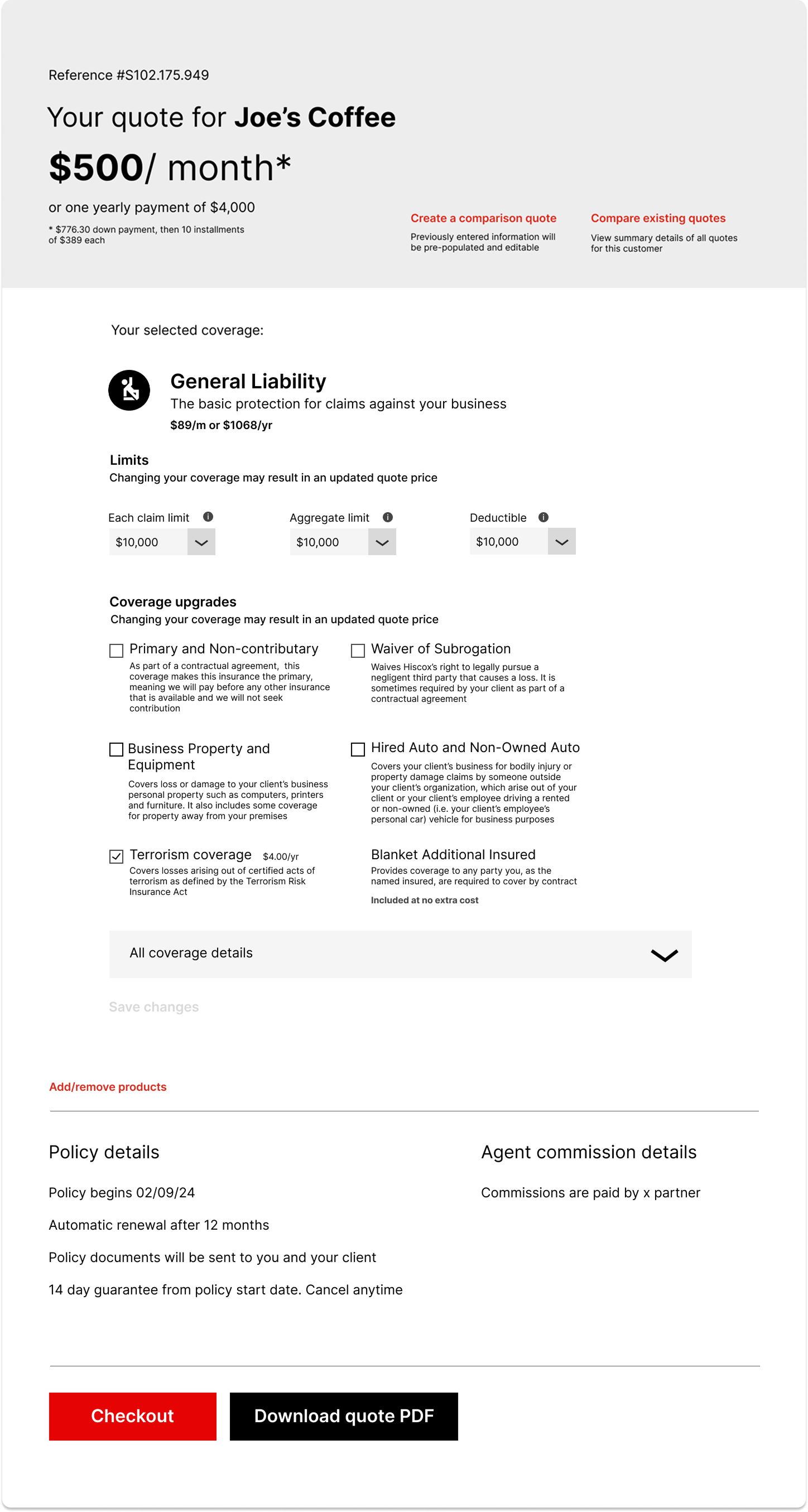
Final design
This update achieved our initial goal, but there’s still more to do.
Now that the users can find the upgrades, we’re realizing they don’t always know what to choose. We should consider making updates to point them in the right direction.
1
Why should this be the only touchpoint for customizations? Offering them earlier can add confidence that Hiscox is the right fit.
2
As mentioned, there’s a thin line between just enough, and too much content on a page. Further research and testing may help us prioritize the information.